
7 Signs Your Therapist Website Needs a Redesign (and How to Build One That Feels Like You)
You’re about to send your website to a potential client when you catch yourself saying, “Ignore the old photos,” or, “I’m planning to update it soon.” Sound familiar? If so, you may be noticing some of the signs your therapist website needs a redesign.
Maybe your site feels outdated, looks too DIY, is difficult to navigate, or simply no longer reflects the quality of the work you do. Your website should help potential clients feel confident about reaching out, not leave you making excuses before they even see it.
In this article, I’ll walk you through 7 signs your therapist website may be ready for a redesign, plus a 10-question self-assessment to help you decide whether you need a simple refresh, a DIY update, or a full redesign.
I’ve spent the last three years designing brands and websites for therapists and service-based business owners, so let’s take a look at what might be holding your website back.

Quick Answer: How to Know If Your Therapist Website Needs A Redesign
A therapist website may need a redesign when it looks like other practices’ sites, doesn’t sound like you, is hard to use on a phone, hides how to book, or shows outdated information. As a rule of thumb, three or more of these signs means a redesign may serve you better than small fixes.
7 Signs Your Therapist Website Needs a Redesign
1. Your colors and logo look like every other therapist’s
A therapist website has generic branding when the practice name could be swapped for another therapist’s without changing how it looks. Common signs include soft neutrals or sage greens, a leaf or botanical logo, and stock-style photos.
There’s nothing wrong with these elements on their own. The problem is when they’re used without intention.
If your website looks like dozens of other therapist websites, potential clients have little reason to remember you. Ask yourself: could someone replace your name with another therapist’s and have the website still make sense?
Clients don’t choose a therapist based solely on credentials. They choose based on connection and fit. Your website should communicate your personality, approach, and what makes working with you different.
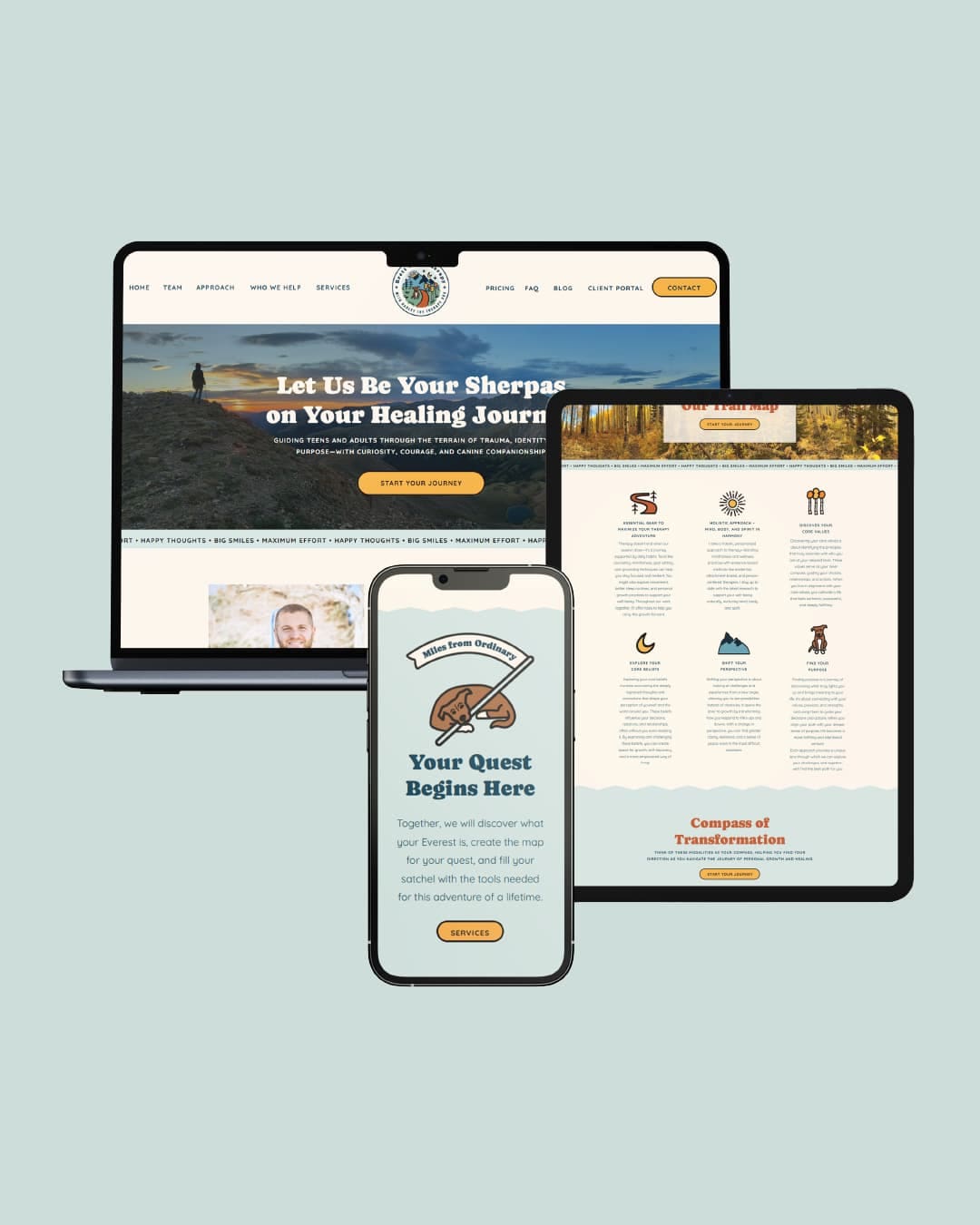
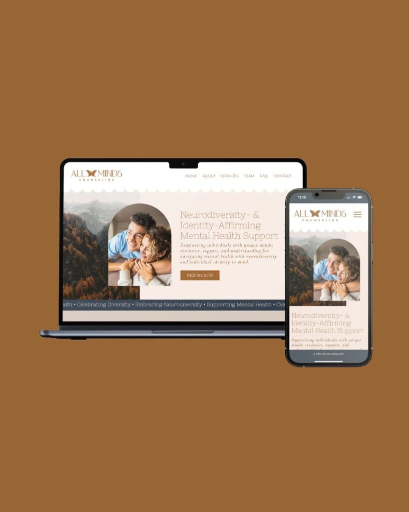
For example, I recently designed a website for an adventurous therapist who incorporates nature into his work. His branding uses national park-inspired elements, warm earthy colors, and subtle nods to his therapy dog. I also designed a site for a neurodiversity-affirming practice using warm, welcoming visuals and messaging that communicates who they serve.
Neither website follows the typical therapist template, yet both work because they reflect the people behind the practice. That’s what helps the right clients recognize a good fit.
2. Your website doesn’t sound or feel like you
Your website should sound like you. If you’re warm, conversational, and encouraging with clients, but your website is stiff, clinical, or full of generic therapy jargon, you’re creating a disconnect before you’ve even had your first conversation.
For therapists, this matters because you’re not just selling a service. You’re asking someone to trust you with vulnerable parts of their life and enter into a relationship with you. Authenticity matters.
Your website is often the first step in building that trust. If your copy feels generic, your visuals feel pieced together, or nothing communicates your personality, potential clients may struggle to imagine what it would actually be like to work with you.
A thoughtful website doesn’t need to be flashy. It simply needs to reflect the quality of your practice and communicate the experience clients can expect.
Ask yourself: If someone landed on my website without knowing me, would they get an accurate sense of what it feels like to work with me? If not, there’s a connection gap your website could be closing.
3. It’s hard to use on a phone
Open your website on your phone and try to find your contact information. If you’re squinting at tiny text, struggling to tap a button, or scrolling sideways to see a page, you’ve found a red flag.
Your mobile site may be the only version of your website a potential client ever sees. A frustrating experience can make your practice feel less polished and give someone one more reason not to take the next step.

4. Visitors can’t tell who you help or how to book
One of the biggest mistakes I see on therapist websites is not clearly communicating three things right away: who you help, what you offer, and how to get started. Potential clients shouldn’t have to scroll, click around, or play detective to figure out whether you’re the right therapist for them.
If your website opens with vague clichés like “you don’t have to do this alone” or “a safe space to heal,” uses broad language that tries to speak to everyone, or gives visitors several competing next steps, your messaging probably needs some tightening.
Your copy should focus on your ideal client’s needs, challenges, and feelings so they can quickly recognize themselves in your words. When someone thinks, “Wait, this is exactly what I’m dealing with,” you’ve created a connection.
Once they decide you’re a potential fit, make the next step obvious. Don’t make someone hunt for your contact information or wonder whether they’re supposed to call, email, fill out a form, or schedule online. Tell them what to do next and make it easy. Otherwise, they may simply peace out.
5. It looks outdated or has old information
Outdated information is one of the biggest red flags on a therapist website, and it can affect trust even more than an outdated design. Old photos, incorrect fees or availability, broken links, outdated bios, or services you no longer offer can all make your website feel neglected.
When potential clients notice those details, they may start wondering whether your information is even accurate or whether anyone is keeping the site up to date. Fair or not, they might even wonder if your therapy skills are as out of date as your website.
Your website doesn’t need to be redesigned every time a new font trend comes along, but it does need to accurately reflect your practice today. If your business has changed significantly since your website was built, that’s a pretty good sign it’s time to give it some attention.
6. Search engines can’t tell what your pages are about
Maybe your page titles are missing or duplicated, your headings don’t follow a clear structure, or your page names are so vague that even Google isn’t quite sure what they’re about. And maybe you’re reading this thinking, “I don’t even know what any of that means.” That’s okay! You don’t need to be an SEO expert to have a website that follows basic SEO best practices.
Some of these issues are completely fixable without a full redesign. But when SEO problems are baked into the structure of your website, a redesign can be a good opportunity to build things correctly from the start.
On-page SEO best practices are built into all of my client website builds, so you don’t have to become an SEO expert just to make your website easier for potential clients to find.
7. Your practice has grown, but your website hasn’t
New services, a new niche, higher rates, or growing from a solo practice into a group practice are all signs that your therapist website needs an update. Your website should reflect the practice you have now, not the one you were building three years ago.

Self-Assessment: Does Your Therapist Website Need a Redesign?
- If you removed my name and logo, would my website still look and feel distinctly like my practice? [Yes/No]
- Does my website sound like me and give potential clients a sense of what it would actually feel like to work with me? [Yes/No]
- Can I easily navigate my entire website on my phone without zooming, squinting, or struggling to tap buttons? [Yes/No]
- Within a few seconds of landing on my homepage, can a potential client tell who I help, what I offer, and what they should do next? [Yes/No]
- Is all of the information on my website current, including my photos, fees, services, availability, bio, and contact information? [Yes/No]
- Does each page have a clear purpose and title that tells both visitors and search engines what the page is about? [Yes/No]
- Does my website accurately reflect my practice as it exists today, including any new services, niche, pricing, or team members? [Yes/No]
- If a potential client visited my website without knowing me, would they understand what makes my approach or practice different from other therapists? [Yes/No]
- Is it immediately clear how a potential client can contact me or book a consultation? [Yes/No]
- Would I feel confident sending a potential client to my website today? [Yes/No]
If you answered “No” to 1–2 questions, start with a refresh. Update your photos and copy, fix outdated information, and improve your calls to action.
If you answered “No” to 3 or more, your website may need more than a few updates. A redesign could help bring your branding, messaging, structure, and user experience back into alignment.
One important exception: If you answered “No” to #1, that’s a bigger deal. If your branding doesn’t feel distinctive or represent your practice, a website refresh alone won’t fix the problem. You may need to rethink the brand before rebuilding the website.
DIY or Hire a Designer?
DIY might be the right choice if your practice is new, your budget is tight, and you have the time and confidence to tackle the work yourself. And no shade to templates! You can get surprisingly far with one when your messaging is solid and you customize it intentionally. The template is just the framework. It’s what you put into it that makes the website feel like you.
But if your brand feels generic, your practice has outgrown your current site, or your website is a major part of your first impression, swapping one template for another may not fix the underlying problem. A new layout can’t fix unclear messaging or a brand that no longer represents your practice.
That’s where a designer can help. A custom website starts with strategy: who you serve, how you sound, and what makes your practice different.
My brand + web package starts at $3,500 and includes a full brand identity plus a 5–7 page, mobile-optimized Showit website, while my brand identity package (without a website) starts at $1,500. Every project begins with brand strategy and research before design work begins.
Frequently Asked Questions About Redesigning a Therapist Website
- How do I know if my therapist website needs a redesign?
- Look for generic branding, a site that doesn’t sound like you, poor mobile usability, unclear booking, outdated information, SEO issues, or a practice that has outgrown the site. Three or more “no” answers on the self-assessment means it’s worth considering a redesign.
- Do I need a redesign or just an update?
- If the look and structure still fit your practice, an update may be enough. If your branding or website no longer reflects who you serve, you’re probably looking at a redesign.
- How much does it cost to redesign a therapist website?
- My brand + website package starts at $3,500 and includes a full brand identity plus a 5–7 page Showit website. My brand identity package starts at $1,500.
- Can I redesign my therapist website myself?
- Yes! DIY can work well when you have the time, some design confidence, and a tight budget. If you want a more distinctive, strategic website without spending weeks figuring it out yourself, hiring a designer may be a better fit.
- Do I need a new logo or just a website?
- It depends on whether your current brand feels like you. If your colors and logo feel generic, updating only the website leaves the biggest problem in place. That’s why I start with brand strategy and offer the logo and website together.
- Will a new website get me more clients?
- A better website helps the people who find you decide to reach out, but it isn’t a guarantee. Referrals, directory listings, and your local reputation matter too. What a redesign does is make sure that when someone lands on your site, it feels like you and makes the next step easy.
- A better website helps the people who find you decide to reach out, but it isn’t a guarantee. Referrals, directory listings, and your local reputation matter too. What a redesign does is make sure that when someone lands on your site, it feels like you and makes the next step easy.
Ready to Redo Your Therapist Website?
Your website is often the first place a potential client decides whether you feel like a good fit. If three or more of these signs your therapist website needs a redesign apply, it may be time to move beyond quick fixes and consider a redesign.
Whatever you choose, the goal is the same: a website that feels like you, connects with the right clients, and reflects the practice you’ve built.
If a custom redesign feels like the right next step, I’d love to hear about your practice. Take a look at my packages and fill out my inquiry form to get started.


Be the first to comment